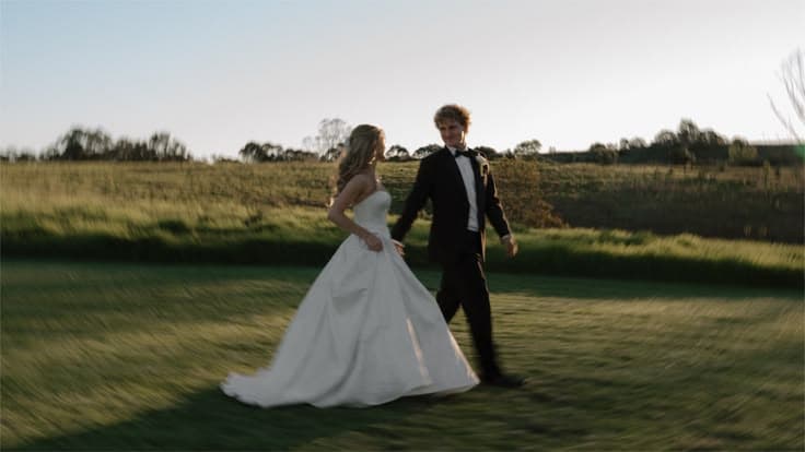
Your wedding colour palette is not a decorative afterthought. It is the invisible thread that connects your florals to your stationery, your bridesmaid dresses to your table linen, and your ceremony arch to your reception lighting. Choose it well, and every vendor decision that follows becomes easier.
This is a look at four of our current favourite wedding colour palettes, what makes each one work, which wedding styles and seasons it suits best, and how to use WedWise’s mood board feature to plan everything around it in one place.
Colour Is Personal. Start There.
For centuries, wedding colours were not really a choice. They were a cultural given. Western weddings meant white: purity, tradition, the silhouette of a church ceremony. South Asian weddings meant red: auspicious, bold, the colour of brides from Lahore to Chennai. These traditions carry real meaning, and giving a nod to your heritage is always worth honouring.
But your wedding is also yours. And if you are planning multiple events, a mehendi, a sangeet, a civil ceremony, and a reception, each one is an opportunity to express a different side of who you are as a couple. The colour story does not have to be uniform across every event. It just has to feel intentional.
The good news is that in 2027, the palette landscape is genuinely rich. Couples are moving away from one-size-fits-all conventions and leaning into palettes that reflect personality, whether that is lush and botanical, warm and rustic, timelessly minimal, or boldly joyful. Here are four of our favourites right now.
1. Ethereal Whites: Chic, Minimal, and Effortlessly Timeless
The couple: You edit rather than accumulate. You’d rather have three things you love than thirty you like, and it shows in how you dress, how you host, and how you’ll marry. You care about how a room feels, not how much is in it, and you trust that less, done beautifully, always reads as more.
The palette: Ivory, soft white, chalk, warm cream, blush-tinged white, with accents in champagne or pale silver.
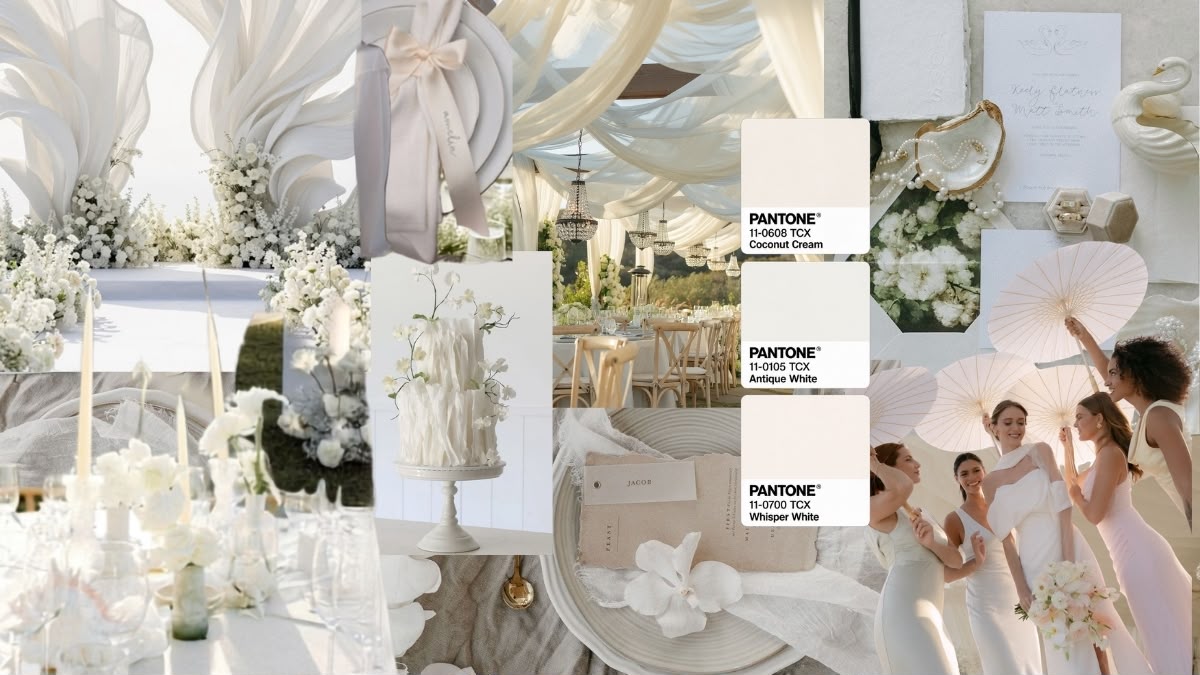
The mood: Understated luxury. This is the palette for couples who want their wedding to feel like it belongs in an Italian countryside estate or a glass-walled, cliff-side venue overlooking the sea. Nothing competes for attention. Everything coheres.
What it reflects: Restraint, taste, and confidence. Ethereal Whites is deceptively complex. Because the palette has no bold anchor colour, every texture becomes the design element: the gathered silk of the table linen, the sculptural calla lilies, the hand-poured candles, the matte ceramic place settings. Couples who choose this palette invest in quality and intentionality rather than volume.
Make it a statement: All-white doesn’t have to mean quiet. One of the most striking ways to use this palette is to ask your guests to wear all white, then make your own entrance in a single bold colour. Suddenly you are the only point of contrast in the entire room, and every photograph frames you automatically. It’s minimalism working as pure theatre.
Best for: Outdoor summer or winter weddings, boutique venues, and couples with a minimalist or editorial sensibility.
Styling tips:
- Use greenery sparingly and only in muted tones (deep sage or eucalyptus) to avoid breaking the palette’s cohesion.
- Vary your whites deliberately. Ivory florals against chalk-white linen against warm candlelight creates depth.
- Gold hardware (frames, cutlery, vase necks) is the only metal that works here. Silver reads too cool; rose gold too sweet.[black accents can be fantastic to give it a modern twist]
How to plan it on WedWise: Build a mood board and pin your venue, florist inspiration, linen samples, and attire references in one view. When everything lives together, you can immediately spot the moments where an ivory is reading too yellow or a white too stark, before you’ve signed a single contract.
2. Rainbow Hues: A Vibrant, Joyful Mix for Couples Who Love Colour
The couple: You’re the ones who fill the dance floor first and leave it last. Your love isn’t quiet and it isn’t meant to be. You want your guests laughing, dancing, and talking about the day for years, and you’d take a wedding bursting with personality over a picture-perfect one that plays it safe every single time.
The palette: Multi-colour and intentionally non-coordinating. Think marigold, fuchsia, cobalt, emerald, violet, coral, and burnt orange, used together with confidence.
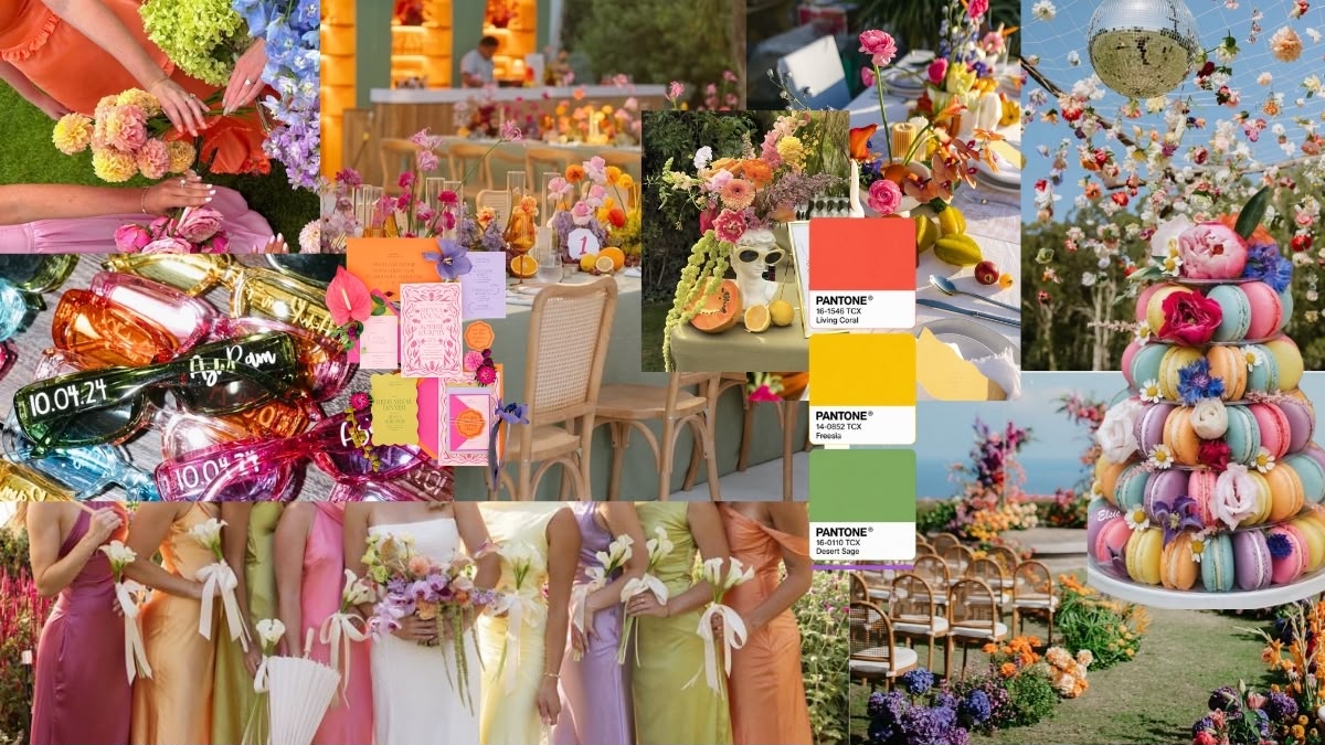
The mood: Pure celebration. This is the palette that says we are not here to blend in. Rainbow Hues is increasingly popular among couples who want their wedding to feel like an event, not a photoshoot, where guests remember the energy as much as the flowers.
Best for: Spring and summer weddings, outdoor or garden venues, celebrations with a festival or bohemian spirit
Styling tips:
- Run a rainbow assortment of flowers along plain flooring or a bare table to really accentuate the aisle or the dinner table. The neutral base does the work of making every colour pop.
- Choose four to five hero colours and play around with those. It gives you room to be expressive while keeping the whole thing coherent rather than chaotic.
- Keep non-floral elements (linen, crockery, signage) in a neutral warm white or ivory so the colour doesn’t overwhelm.
- This is a fun theme, so have fun with it and let your imagination run wild. There’s no need to restrict yourself too much here.
How to plan it on WedWise: With a palette this expansive, a mood board isn’t optional, it’s the only way to check that your florist’s interpretation and your decorator’s interpretation are actually speaking the same language. Pin everything side by side and make decisions from the full picture.
3. Autumn Tones: Burnt Oranges, Deep Reds, and Mustards for Cosy, Rustic Charm
The couple: You’re happiest around a long table with good food, good wine, and everyone you love in one place. You value warmth over polish and connection over spectacle. Home, in every sense, is your favourite place to be, and you want your wedding to feel like the most generous, candlelit version of it.
The palette: Terracotta, burnt sienna, mustard, rust, deep burgundy, warm taupe, and dried botanicals.
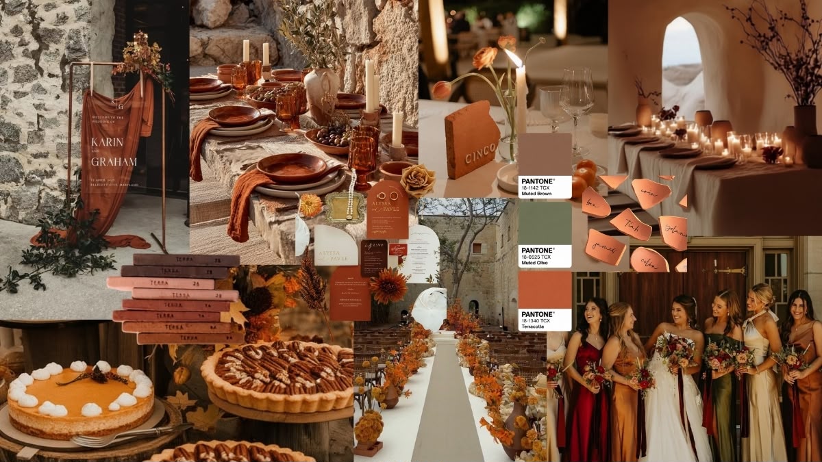
The mood: Warmth and groundedness. Autumn Tones weddings feel like the best dinner party you’ve ever attended: candlelit, unhurried, abundant. This palette has serious momentum in 2026, driven partly by Pantone’s Mocha Mousse influence and a broader cultural appetite for organic, nature-connected aesthetics.
What it reflects: Warmth, generosity, and a love of texture. Autumn Tones benefits enormously from tactile materials. Linen, raw wood, wicker, dried pampas grass, and terracotta vessels all amplify the palette’s warmth in ways satin or lacquered surfaces simply can’t. It’s also one of the most forgiving palettes for mixed-venue scenarios, a garden ceremony and a barn reception, for example, because the colours read naturally in both settings.
Best for: Autumn and late-summer weddings, rustic or outdoor venues, farm estates, and winery or vineyard settings.
Styling tips:
- Introduce burgundy or deep plum as your darkest anchor to give the palette depth. Without it, the warm tones can read flat in photographs.
- Dried botanicals (pampas, dried palms, seed pods) stretch your floral budget because they double as long-lasting decor.
- Paper and stationery in warm kraft tones complete the palette at no significant cost.
How to plan it on WedWise: Season-dependent palettes like this one are especially reliant on vendor availability. Specific dried flowers, linens, and venue types book up fast in peak autumn months. Use your WedWise mood board to brief vendors early so everyone’s working from the same visual reference.
4. Garden Greens: Forest-Inspired Tones for a Fresh, Organic, Botanical Feel
The couple: You’re drawn to things that feel natural and unforced, whether that’s a slow morning outdoors or a wedding that looks like it simply grew where it stands. You don’t want anything that feels overworked or staged. Understated, romantic, and a little wild is exactly your kind of beautiful.
The palette: Sage, eucalyptus, moss, deep forest green, olive, ivory, and soft white, with occasional accents in blush or champagne.
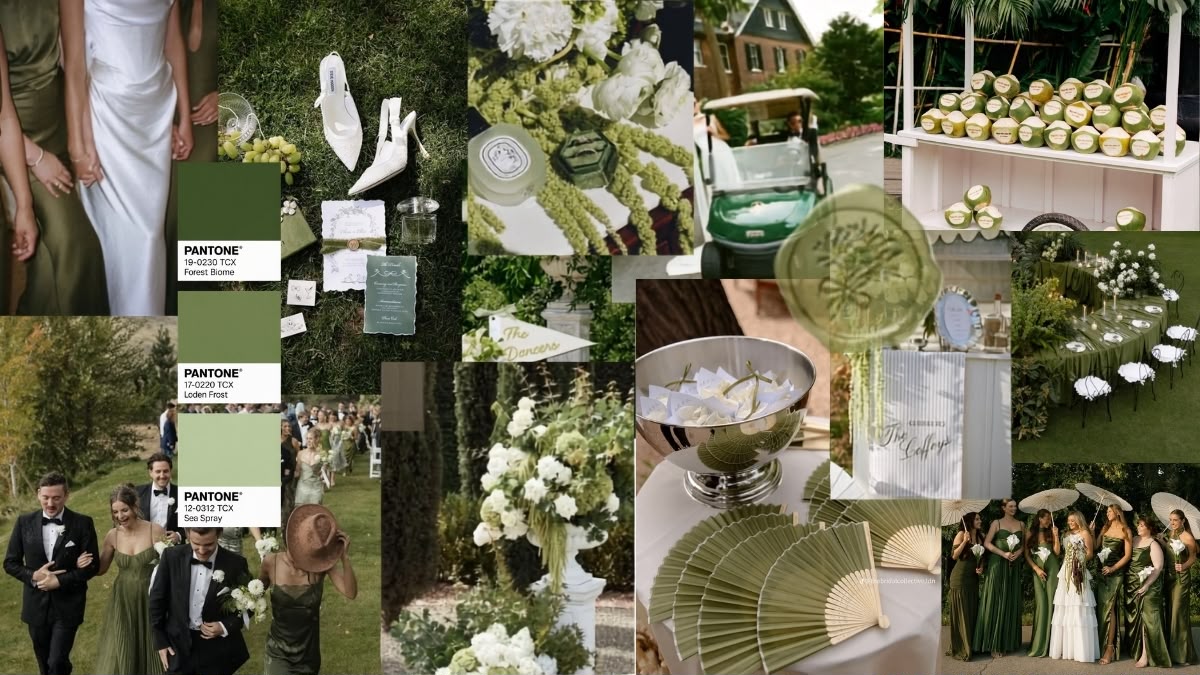
The mood: Living, breathing, effortlessly romantic. Garden Greens weddings feel like the couple stepped into the venue and the flowers grew there naturally. This is the palette for couples who want something that looks both designed and undesigned at once.
What it reflects: Ease, romance, and quiet versatility. Green is one of the most flexible neutrals in wedding design. It reads differently depending on what sits beside it: cooler and more editorial next to white, warmer and more romantic next to ivory, dramatic and maximalist next to deep burgundy or navy. Garden Greens gives you enormous creative latitude within a single, cohesive palette.
Best for: All seasons, though most striking in spring and early summer. Suits garden venues, greenhouse spaces, tropical settings, and woodland ceremonies.
Styling tips:
- Mix greens deliberately, not all sage, not all eucalyptus. Layering different shades and textures (fern, hydrangea, tropical leaf, jasmine vine) is what makes this palette look expensive.
- Use fruit as decor. Lemons, pears, and limes alongside florals are a Garden Greens signature that photographs beautifully and costs less than the equivalent floral volume.
- Avoid artificial or oversaturated greens in your lighting. Warm white or amber uplighting keeps the palette feeling natural.
How to plan it on WedWise: Garden Greens is one of the most Pinterest-heavy palettes out there, which means thousands of variations to get lost in. Narrow your references early. Build a tight mood board of 10 to 15 images that captures your specific interpretation, then share it directly with your florist and venue stylist.
How to Choose the Right Palette for Your Wedding
If you are still deciding, ask yourself four questions:
- What is the season and time of day? Warm, rich tones (Autumn Tones, Rainbow Hues) read better in daylight or golden-hour light. Ethereal Whites and Garden Greens are stunning in both natural and artificial light.
- What is the venue’s dominant material? Stone and marble suit Ethereal Whites. Wood and exposed brick amplify Autumn Tones. Garden Greens works in almost any setting. Rainbow Hues needs a neutral backdrop or it competes with everything.
- What is your budget structure? Rainbow Hues and Garden Greens can be scaled by leaning on foliage, dried botanicals, and fruit. Ethereal Whites often requires a higher per-stem spend to look intentional rather than sparse.
- What do you want guests to feel? Ethereal Whites = awe. Rainbow Hues = joy. Autumn Tones = warmth. Garden Greens = ease and romance.
Plan Your Entire Wedding Around Your Palette on WedWise
Once you have identified your palette, the next challenge is keeping every vendor and every decision aligned to it over the months of planning that follow. That is exactly what WedWise’s mood board feature is built for.
Pin your venue photos, florist inspiration, linen options, attire references, stationery samples, and cake designs all in one place. Share the board with your vendors. Update it as your vision evolves. When you can see everything side by side, rather than scattered across browser tabs and WhatsApp chats and saved Instagram posts, you make better decisions faster.
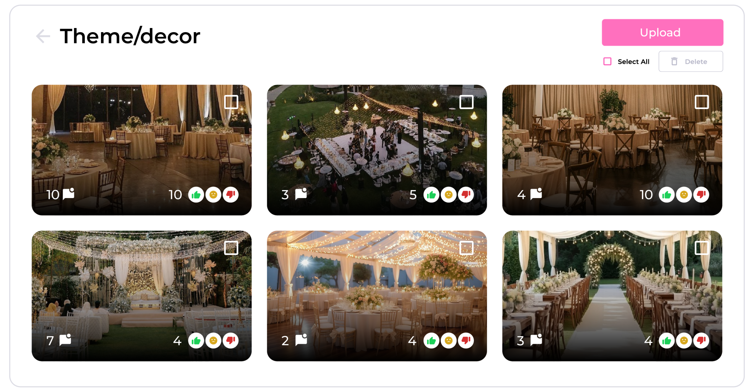
Your color palette is the foundation. Build everything else on top of it.
Start building your wedding mood board on WedWise today.